Neca shirts input wanted

vroom

Member
Established Member
Joined
Sep 6, 2012
Messages
201
Location
ct
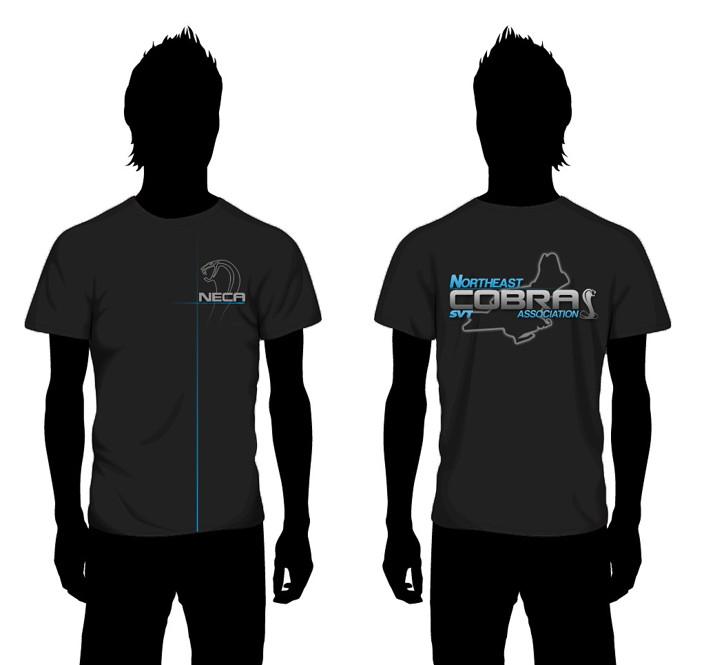
Excellent start, here's my suggestions.

1. tightening up the outline of the states. Try and get a shape that is the exact outline of NY,CT, NH, VT, MA and ME

2. adjust the color: Instead of light blue try something closer to sonic blue

3. I would think on the front of the shirt we'd want just a N.E.C.A. , on the back we have the full logo that Mooch has designed

:beer:

+1 on the states...don't mind the color choice, and it wouldnt be a bad idea to just have N.E.C.A. on the front and the full logo on the back. as it was mentioned not everyones car can be fit onto the shirt, eventhough i do like the one with the cars on the back also.
 

mooch29

Low n' Slow
Established Member
Joined
Jul 1, 2008
Messages
6,350
Location
MA
Alright I just came up with this, I like the front, but I don't think it matches the back well enough with my original logo. BTW I took peoples suggestions and made the states a little better. I think I used the wrong one last time :lol1:

I'm just trying to branch away from the usual upper left corner for this, but if thats what everyone wants than it can be changed. Let me know what you guys think!

8516629721_99901f59e1_b.jpg
 

03vertsnake

Driver
Established Member
Joined
Jan 10, 2010
Messages
314
Location
New York
I really like the designs so far. I like the terminators on it especially the vert and coupe. Would it be possible to do the snake in the grill on boh instead of the pony? I think that would be a cool detail...
 

Tifosi2003GT

Well-Known Member
Established Member
Joined
Apr 9, 2006
Messages
4,914
Location
R.I
Just make the Cobra Emblem look more realistic....Looks Sick Tho!!!!!
 
Last edited:

03vertsnake

Driver
Established Member
Joined
Jan 10, 2010
Messages
314
Location
New York
Alright I just came up with this, I like the front, but I don't think it matches the back well enough with my original logo. BTW I took peoples suggestions and made the states a little better. I think I used the wrong one last time :lol1:

I'm just trying to branch away from the usual upper left corner for this, but if thats what everyone wants than it can be changed. Let me know what you guys think!

8516629721_99901f59e1_b.jpg

That does look good. What about using the same style cobra on the front and back?
 

RIO RED SNAKE

4:10's = The Suck
Established Member
Joined
Jan 4, 2009
Messages
5,233
Location
So FLA
Someone says svt cobra.... I think terminator. Not the fox and not a shelby. But thats just me. And no its not cause I have one ive thought this before. You say shelby I think gt500. Yes theres multiple svt cobras but to me theres one I think of. Not everyone has a 03/04 and I understand. But not everyone has a cobra either yet they're a part of NECA and will wear the shirt. If people only want to wear there car then put a banana on the shirt and call it a day bc your not gonna make everyone happy. Not trying to be a dbag its just my opinion. That being said ill wear whatever aslong as I can be a active member in which could be a awesome club with awesome people.

I like mikes shirt and would like to purchase one with the cars on the back.

Dave

I agree 100% but since my car has like 8 visible snakes on it and svt on for sills it is a cobra somewhere in there lol..but mooches love the shirt design :beer:
 

MassDSGsvt

FORCE FED BOOST
Established Member
Joined
Nov 22, 2011
Messages
1,079
Location
Mass .... south shore
I agree 100% but since my car has like 8 visible snakes on it and svt on for sills it is a cobra somewhere in there lol..but mooches love the shirt design :beer:

Good to see I didnt sound like a complete dbag. Just putting my opinion out there.


Mooch this looks sick. You need to start you own buisness bc you are pretty damn talented. Keep up the good work
 

ninety5fiveoh

DHG FTW!
Established Member
Joined
Nov 19, 2005
Messages
2,295
Location
Fairfield, CT
Alright I just came up with this, I like the front, but I don't think it matches the back well enough with my original logo. BTW I took peoples suggestions and made the states a little better. I think I used the wrong one last time :lol1:

I'm just trying to branch away from the usual upper left corner for this, but if thats what everyone wants than it can be changed. Let me know what you guys think!

8516629721_99901f59e1_b.jpg

Moochacho, LOVE the front logo, there are a few small details I would change about the back one though. If you want any input, you could even send me the Ai or Ps file and I could fool with it. I obviously won't take any credit for it since you designed it, its just easier to explain visually, plus it's nothing huge, just little tweaks. You can check out the changes and see what you think. I love the color choice though, that's the identical colors on my business card!

PM me for my email if you are interested!

I'm gonna spend some time in Illustrator tonight working on the one I came up with so I could dick around with both. I had a crazy night last night at work then I went to pick up tires for my buddy so I didn't have time.
 

mooch29

Low n' Slow
Established Member
Joined
Jul 1, 2008
Messages
6,350
Location
MA
Moochacho, LOVE the front logo, there are a few small details I would change about the back one though. If you want any input, you could even send me the Ai or Ps file and I could fool with it. I obviously won't take any credit for it since you designed it, its just easier to explain visually, plus it's nothing huge, just little tweaks. You can check out the changes and see what you think. I love the color choice though, that's the identical colors on my business card!

PM me for my email if you are interested!

I'm gonna spend some time in Illustrator tonight working on the one I came up with so I could dick around with both. I had a crazy night last night at work then I went to pick up tires for my buddy so I didn't have time.

Sent you a PM :beer:

Thanks for the compliments/suggestions everyone. I will continue to work on it until I think it's perfect :beer:
 

StangSteph

Member
Established Member
Joined
Apr 28, 2010
Messages
457
Location
Cranston, RI
Alright I just came up with this, I like the front, but I don't think it matches the back well enough with my original logo. BTW I took peoples suggestions and made the states a little better. I think I used the wrong one last time :lol1:

I'm just trying to branch away from the usual upper left corner for this, but if thats what everyone wants than it can be changed. Let me know what you guys think!

8516629721_99901f59e1_b.jpg

I like it! even though I'm not really part of this lol. You are amazingly talented!
How would it look if the front design was slightly larger and centered? I like the outline and fading of the cobra.

edit: and keep the blue lines, makes it look neat and clean...IMO
 
Last edited:

KillerMike

Senior SVT Hall Of Fame
Established Member
Joined
Mar 19, 2006
Messages
327
Location
Marlboro, MA
I like it! even though I'm not really part of this lol. You are amazingly talented!
How would it look if the front design was slightly larger and centered? I like the outline and fading of the cobra

I agree. The shirts are sick mooch but i think the front should be centered so it doesnt look like a golf shirt or a detail shop shirt but an actual brand name shirt kinda look. Know what i mean?

Sent from my DROID RAZR using Tapatalk 2
 

mooch29

Low n' Slow
Established Member
Joined
Jul 1, 2008
Messages
6,350
Location
MA
I like it! even though I'm not really part of this lol. You are amazingly talented!
How would it look if the front design was slightly larger and centered? I like the outline and fading of the cobra.

edit: and keep the blue lines, makes it look neat and clean...IMO
Thanks Steph!! I'll try that out.
I agree. The shirts are sick mooch but i think the front should be centered so it doesnt look like a golf shirt or a detail shop shirt but an actual brand name shirt kinda look. Know what i mean?

Sent from my DROID RAZR using Tapatalk 2

Thanks man! I'll try that centered and see how the lines work.
 

vroom

Member
Established Member
Joined
Sep 6, 2012
Messages
201
Location
ct
Alright I just came up with this, I like the front, but I don't think it matches the back well enough with my original logo. BTW I took peoples suggestions and made the states a little better. I think I used the wrong one last time :lol1:

I'm just trying to branch away from the usual upper left corner for this, but if thats what everyone wants than it can be changed. Let me know what you guys think!

8516629721_99901f59e1_b.jpg

i like the style of the snake on the back, maybe match the front one to it. also try centering it like others were saying to make it totally different than the traditional off to the side.
 

ninety5fiveoh

DHG FTW!
Established Member
Joined
Nov 19, 2005
Messages
2,295
Location
Fairfield, CT
Alright fellas, here's one I came up with. Me and Mooch have been throwing ideas at each other as well. Thoughts? I love Mooch's cross hare on the front of the shirt, I DEF think that needs to be incorporated somehow.

EDIT: For some reason, my blue looks TERRIBLE. It is the same blue as Mooch's in his logo, Photobucket sucks the big one.

NECA_shirt_full_zps09be5174.jpg
 

f2hatch

Well-Known Member
Established Member
Joined
Aug 11, 2007
Messages
3,485
Location
CT
Alright fellas, here's one I came up with. Me and Mooch have been throwing ideas at each other as well. Thoughts? I love Mooch's cross hare on the front of the shirt, I DEF think that needs to be incorporated somehow.

EDIT: For some reason, my blue looks TERRIBLE. It is the same blue as Mooch's in his logo, Photobucket sucks the big one.

NECA_shirt_full_zps09be5174.jpg

Looks great But I like the NECA with the cross hares on front more
 

Users who are viewing this thread


Top