nice!
You are using an out of date browser. It may not display this or other websites correctly.
You should upgrade or use an alternative browser.
You should upgrade or use an alternative browser.
~My New "Terminator" Car Show Display~
- Thread starter 04sleeper
- Start date
Very well done :beer:
looks good Kev
OK. I usderstand now.IMO, something along the lines of stangaholic's signature pic would be awesome blown up to full size. Words would be easily readable on the dark background, and not take away anything from the car. Regardless, awesome effort. Have been thinking of doing the something like that for mine.
I may look into another picture to start out with now that I did this one.I think finaltheorem summed it up nicely. while I like the fence in the background with the larger bold TERMINATOR text, it may be adding too much to the picture overall like he was saying. I wouldn't fade the picture either, but working on something to have the text/car offset would probably work better and having a solid background behind the text is probably what would work best. then you can just play with the text color and size.
Engine, Transmission, etc., they all stand out because of the font size. The rest is just too small imo based on the other colors going on with the text over it. offset them and maybe a different pic as suggested may be the ticket.
:lol::lol::lol:Nice I can picture you transporting it to a car show in a Pope Mobile like enclosed acrilyc trailer!!
I understand. I guess I will have to look at some and see what I like and try to duplicate it somehow.I'm sorry I can't provide you with any real car portraits to demonstrate what i mean, but I do have signatures I used to make back when I was addicted to this MMORPG called Runescape. I made a lot of signatures for me and other people (my gamer tag was bsjoe).
These are what I'm trying to get you to see. You want to identify what your foreground (aka what you want people to see is) and your background (what fills in the empty spaces). You don't ever want your background to be more visible/eye catching/detailed than the foreground.
I really hope that these examples show what I mean to you.
I'd probably start by looking at posters for car events like:
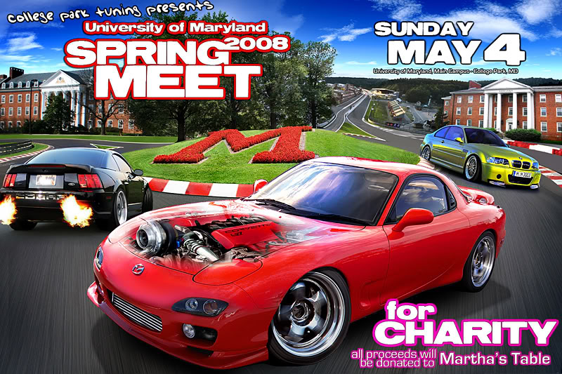
Notice the placement of the text. All of the text in non important, boring, areas that are generally the same, like on top of a blue sky, on top of the building, and on the road. What you do NOT want is to have half the text in front of the tree and the other half in the sky. When the background changes under the text, it makes it hard to read.
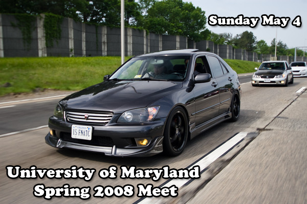
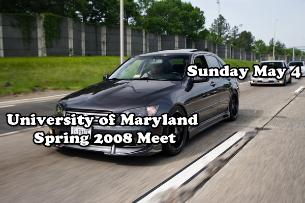
Obviously the first one.Ok, I made these two examples of text placement to show you what I mean. The car and text I want to be in the foreground and the rest to be in the background. The photographer already made my job easier by taking the pic while the car was moving making the background more blurry to begin with. Second, my text placement is not only on the car, which I want people to look at (so don't put the text over the your main focus) and over a background that is going to be hard to read.
The second pic I put the text over the blue sky and over the moving road. Which version do you think is better?
:beer:Very nicely done!! :beer:
:beer:nice!
:beer:Very well done :beer:
Thanks Bro. :beer:looks good Kev
:thumbsup:
looks great!
Looks good bud. I've been thinking about doing similar just been too busy.
Very Nice!
It really adds to a car on display.
Now, a very important piece of advice. If you display on grass stake the display into the ground, and if on a paved parking lot, use sand bags to keep it tied down. You never know when a gust of wind or an obnoxious little kid might knock it into your car, or worse the one next to you.
Excellent advice. Larger display most definitely do get blown around. I've seen it happen.
Ok, I made these two examples of text placement to show you what I mean. The car and text I want to be in the foreground and the rest to be in the background. The photographer already made my job easier by taking the pic while the car was moving making the background more blurry to begin with. Second, my text placement is not only on the car, which I want people to look at (so don't put the text over the your main focus) and over a background that is going to be hard to read.
The second pic I put the text over the blue sky and over the moving road. Which version do you think is better?
2010 UMD spring meet picture thread
Excellent illustration showing where and where not to place text. I certainly learned a lot from your comments.
Thanks all for the comments and advice. This is my first try at something like this so I may try to find another suitable picture and give it another whirl.
I can always hang this picture in my garage.
I can always hang this picture in my garage.
Looks Great! :banana:
so yeah, um, hint hint, if you get bored (cough) i would love to have one of those for my jalopy ;-)
here is a small version of the one I use at shows (wording is diff now but same basic thing)


Looks great Kevin, need to setup a photo shoot for mine now. 
That compliments your car great. Great job Kevin
damn, thats hot, what heels are they???
Too bad you're going to need a new one every month with the way you switch wheels.
LMMFAO!!!! Now ain't that the truth!!
Looks good though. Kinda hard to screw it up tho. I could take a sh!t, stick a picture of your car on top and it'd look good.
Users who are viewing this thread
Total: 2 (members: 0, guests: 2)

