2015 CAD images

Mustang4vSVT

4x4ing this mofo up!
Established Member
Joined
Dec 7, 2005
Messages
934
Location
Montebello
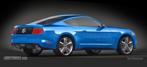
while at a redlight today this was across from me and i finally realized what the '15 images/prototypes remind me of....

images


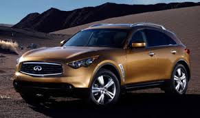
decent looking suv. Piss poor looking Mustang...

edited with a smaller pic.
 
Last edited:

9secondko

9secondko
Established Member
Joined
Mar 24, 2009
Messages
487
Location
Orange County, CA
Sharing this quick Photoshop I did. I think it looks pretty sick...

image-176006111414_zps3c47caca.jpg~original

That looks nice.

I'd like it if it looks like that quite a bit.


but the renders....

basically replace the headlights with round headlights and you have...

the current RETRO CAR,

i have been following the renders by the very talented Cahzcron on 6G.

While his work is amazing, the actual design og he car is horrid. Looks like a confused car. Like too many design cues that don't match.

As a designer in many disciplines myself, this really bothers me.

When you look at an 03 Cobra, a 13-14 Mustang, an 87-93 CT or LX for that matter, a 65-70, the cars look like they were put together and designed very consistently, with every part of the car complimenting the rest.

Looking at this confused mess is shocking. Like a "new edge" front end mixed with the jellybean mid and aft of the previous car. Not a pretty sight.

Not a fan of retro at all, but at least the 13-14 looks refined and purposed, with a designed all around that compliments the rest of the car.

Was very excited. Now I am worried.

It looks retro except for the front end.

Looks basically like the current car with new face on the front.

In fact, the rear looks more retro than the 13-14.

And what's up with the roundedness of the inside taillight louvers? It doesn't matched the sharp lines of the front end. In fact, neither does the deciedly retro looking fastback roofline.

I had ecpected and upsweep in a straight line going from the front window to the rear and the trunk being higher than the front.

also think an oval back window is a mistake instead of ending it in a sublte trapezoid like the front grille.

I'm hoping these were done from some early/outdated CAD project.

IF this is actually the car, I hope it's simply to calm down the retro luddites so that the rest of us can see the Mustang move into modern times and look like thhe sports car it has the potential to be. That would mean an update in two years with some redesigned sheetmetal.

As of now, Mays' commitment to leaving the past in the past and moving forward is seeming a lot like a miscommunication.

Retro isn't the defining mustang look. It has really only been here in the 60's and in this last gen.

The original 5.0 looked nothing like the old car. Neither did the New Edge.

Let's see something truly modern please.

I mean, seriously, why take the coolest car in Fords stable and "oldify it" so that even the Fiesta looks more like a sports car? That would be mistake.

People also don't want the secretary car anymore. the new camaro styling beating the mistang in sales is a bug indicator of that.


these supposed cad renders look like a design that was paralyzed by fear of actual change.


that's the problem with old nameplates. you have to reinvent every now and then and be willing to slay sacred cows. otherwise you are left with an irrelevent design. Some have decided to actually retire nameplates because they have no vision for the future of a product.

Mustang cues from the past that can be kept:

1) running horse (duh)
2) triple tail lights (can do these in a variety of stunning ways.)
3) some form of side scoop. it's tim now for a reverse scoop with functional vents.

that's it.

then there are the intangible qualities:

sporty
lots of buyer choice in models. lots of options
multiple trim levels (but not too many)
A base car that isn't crazy looking, but still very sporty, while allowing a top tier model to look very aggressive while not being limited by the lowest common denominators.

take that from the spirit of the car, but bring it into modern times.

reinvent.

the upward slant on the rear quarter window is a good move. the sharp angles on the front end is a good move.

If that styling carries over to the rest of the car, it would be great.

If not, I sure hope they fix it quickly.

The way the back of the render slopes make it look kind of "dopey."

and looking at the back, the way everything kind of bends to the sides sloping down is very dopey as well.

hope that isn't the case.
 
Last edited:

Users who are viewing this thread


Top