Edit: New Poll with the redesigns of #3.
Please close this one for me dwight
So I know some people had been talking about business cards for a little while, but I don't think I ever saw anything come of it. We had a bunch made up at the office, and the guy at the print shop is giving me a great deal on 1000.
Design 1

Design 2

Design 3

After I get them printed, I can send them out to anyone who wants some. I would just want you guys to send a self addressed stamped envelope to me and I'd send you between 10-20 of them. Pretty much how ever many I grab out of the box when I have your envelope in my hand. Gonna get them made up either way, I just know I won't need 1000. They won't be here by the time we go to OC, but should be shortly after that. And the print won't look that blurry, the pics are just bad.
PM me if you want my address. Don't really want to post that on a public forum.
Edit:
Here is a new design for #3. I don't know how to modify the poll, but if you like this one, just post it I guess. 3 was winning anyway.

Bigger Logo

Please close this one for me dwight
So I know some people had been talking about business cards for a little while, but I don't think I ever saw anything come of it. We had a bunch made up at the office, and the guy at the print shop is giving me a great deal on 1000.
Design 1
Design 2
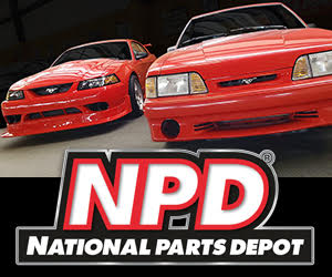
Design 3
After I get them printed, I can send them out to anyone who wants some. I would just want you guys to send a self addressed stamped envelope to me and I'd send you between 10-20 of them. Pretty much how ever many I grab out of the box when I have your envelope in my hand. Gonna get them made up either way, I just know I won't need 1000. They won't be here by the time we go to OC, but should be shortly after that. And the print won't look that blurry, the pics are just bad.
PM me if you want my address. Don't really want to post that on a public forum.
Edit:
Here is a new design for #3. I don't know how to modify the poll, but if you like this one, just post it I guess. 3 was winning anyway.
Bigger Logo
Last edited: