Logo help. Need Help!

shhak

Active Member
Established Member
Joined
Mar 31, 2007
Messages
2,648
Location
Iron City, TN
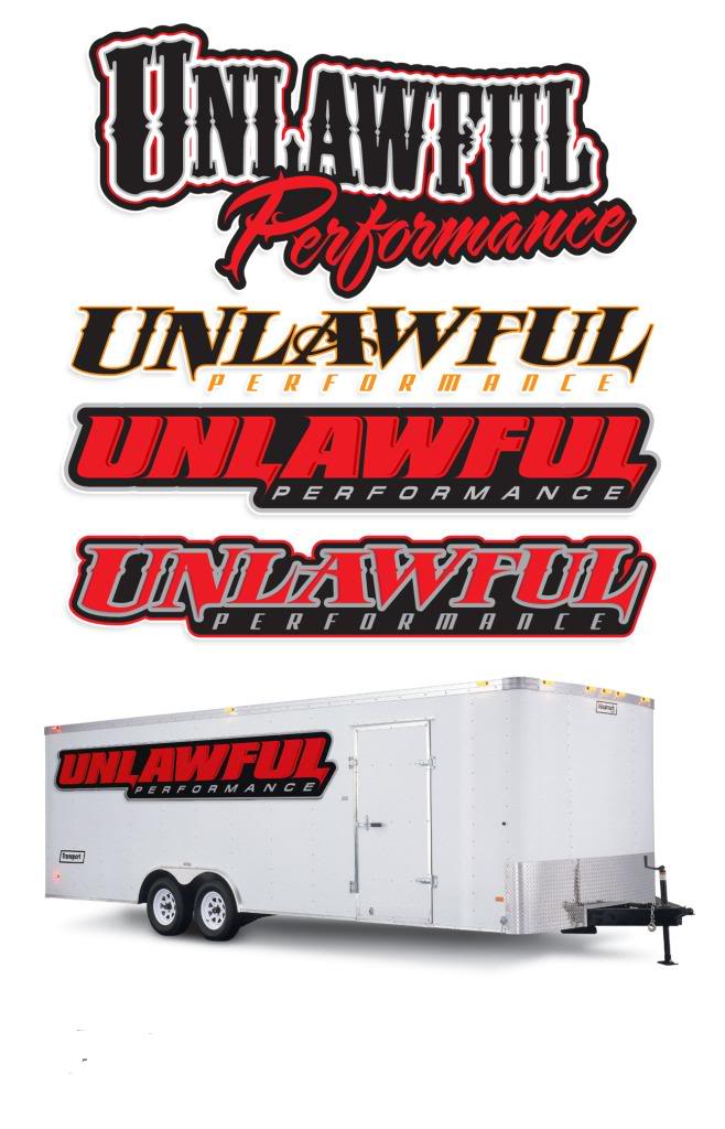
We're working on opening up a shop down here and I need some help with the logo. A buddy came up with the name and a friend of his did the logo ideas we have now, but it's needs a little something more.

Looking for someone to add some sort of a bandit/criminal face to the upper left hand corner. Or any other ideas....

I personally like the 4th one down (right about the trailer picture), but feel free to edit whichever one you want. Just looking for ideas.:beer:
5.jpg
 

69clark

Active Member
Established Member
Joined
Jan 23, 2006
Messages
1,235
Location
Ravena, NY
I like the third one down as it is the easiest to read, which should be important when branding your company.
 

ninety8 GT

Mustang Fanatic
Established Member
Joined
Jul 12, 2006
Messages
405
Location
Wartown, GA
3rd one down for me as well because of the clarity of font like the above poster said. And instead of a bandit logo id maybe go with something actually performance related like this...
02.jpg
 

first cobra

New Member
Established Member
Joined
Nov 24, 2009
Messages
119
Location
Bowling Green,KY
i am a graphic designer at coca-cola i do this kinda stuff everyday! I get stuck between three and four designs a lot of time to and i usually print them all and take a vote on them. I would go for the one that stands out the most and grabs the people's attention the most! I like the criminal idea in the background, add some shadowing and maybe a motor and flames or checkered flags breaking apart in flames to! If i can find some time at work i could draw this idea up for you!
 

shhak

Active Member
Established Member
Joined
Mar 31, 2007
Messages
2,648
Location
Iron City, TN
i am a graphic designer at coca-cola i do this kinda stuff everyday! I get stuck between three and four designs a lot of time to and i usually print them all and take a vote on them. I would go for the one that stands out the most and grabs the people's attention the most! I like the criminal idea in the background, add some shadowing and maybe a motor and flames or checkered flags breaking apart in flames to! If i can find some time at work i could draw this idea up for you!

Any help would really be appreciated man! I'm the least artistic person you'll ever meet...:bash:
 

HellaBoost

New Member
Established Member
Joined
Apr 6, 2009
Messages
172
Location
Kentucky
i like the bandit idea but it would be cool if you could put some pistons under it kinda like the skull and crossbones?!
 

CraigsSnake

Active Member
Established Member
Joined
Aug 29, 2006
Messages
1,347
Location
Orlando, FL
I'm a creative design artist in Orlando, and most of the work I do is for Disney, Universal Studios, Harley Davidson, and Nascar. When you design a logo you want to keep the amount of colors down and try and keep it simple. You don't want a logo with a lot of detail because then it won't stick in people's head, think about it, the most recognized logos in the world are extremely simple, McDonalds is just a big golden M, Nike is just a check, etc. Don't get to crazy with it. And keeping the colors down is a good idea also because when you decided to go and get it printed on something like shirts or mugs or whatever the company printing it is going to charge you per color and where I work it's $95 per color. Keep that in mind. I think what you have looks nice and clean, and people will remember it. Adding a simple bandit or something may improve it a little, but it may also clutter it. I hope any of this info helps you out.
 

chrisweekspc

New Member
Established Member
Joined
Mar 21, 2005
Messages
687
Location
panama city beach, florida
I own a printing company here and while I like ALL the designs, I think the one that is comp'd on the trailer is the best. Easy to read, clean and uncluttered, and passes the squint test. The whole idea of a logo is of course to brand your identity, but for trailers and signage - it needs to be readible, and quick when cars are passing by at 50+ MPH.

Good luck with your business!
 

shhak

Active Member
Established Member
Joined
Mar 31, 2007
Messages
2,648
Location
Iron City, TN
I'm a creative design artist in Orlando, and most of the work I do is for Disney, Universal Studios, Harley Davidson, and Nascar. When you design a logo you want to keep the amount of colors down and try and keep it simple. You don't want a logo with a lot of detail because then it won't stick in people's head, think about it, the most recognized logos in the world are extremely simple, McDonalds is just a big golden M, Nike is just a check, etc. Don't get to crazy with it. And keeping the colors down is a good idea also because when you decided to go and get it printed on something like shirts or mugs or whatever the company printing it is going to charge you per color and where I work it's $95 per color. Keep that in mind. I think what you have looks nice and clean, and people will remember it. Adding a simple bandit or something may improve it a little, but it may also clutter it. I hope any of this info helps you out.

Excellent point:beer: I never thought about it like that, but you are 100% right. (guess that's why they pay you the big bucks.:poke:) I still think a little shadow'd looking bandit in the upper left corner would still look ok. I may be wrong though. :shrug:
 

T76 Mach

Well-Known Member
Established Member
Joined
Feb 26, 2003
Messages
2,757
Location
H-Town,Texas
I design custom stickers and shirts and normally dont release a rough draft without any money up front,but its the holidays :thumbsup:.So let me know if we can do business :beer:


outlaw.gif


outlaw-1.gif
 

66speed

Ya dun goofed
Established Member
Joined
Apr 23, 2004
Messages
7,906
Location
Houston
I like the 2nd, but the name of the shop makes it sound like yall are crooks. Maybe not an image you want.
 

Users who are viewing this thread


Top